Photography Before + Afters: My iPhone
Post Processing is pretty subjective. Many photographers post processing, or editing, style can vary depending on everything from moods to season changes, or even upgrading equipment or learning new tricks. I've been photographing for almost 2 years now, and there is a lot that has changed about my post processing style. A lot of my style is influenced by other photographers who's work I love, and also my general interests. I enjoy neutral color pallets, so in many of my photos you won't find an array of color; I generally stick with boosting 1-4 main colors and the rest lay flat.
After looking through my photo gallery I noticed how many photos I only have edited versions of, not the originals. Many people do this, often times when scrolling through your feed you see only the edited photo, not in its original state; and for obvious reasons, it's prettier that way! But for this post I thought it would be interesting to show you a few of my before and after shots. All of the photos in this post are taken with my iPhone 6. The before's are straight out of the camera, no editing (with the exception of the "before" banner") and the afters have been edited on my phone using the VSCO or Afterlight apps. Do keep in mind, since all of these are taken with my phone they were all pretty much intended for use on Instagram (Note the square shape on a few.) I decided to do a different genre for each photo: Fashion, Music/Concert, Landscape, and Interior. Enjoy!
This is one of the first photos I took after getting my iPhone 6. I had just gotten this new clothing rack after painting the ugly beige walls in my room white, so I thought the moment warranted a photograph. As you can see, even after painting, the walls still weren't white enough for me so I boosted the brightness and the contrast to really make the clothing pop. Contrast is one of my favorite tools because in addition to really bringing out elements in a photo, it also makes the photo appear sharper--The sharper the better! I think I must have toned down the vibrance/saturation a bit as well because the color in the hangers is definitely tones down. So there's photo #1!
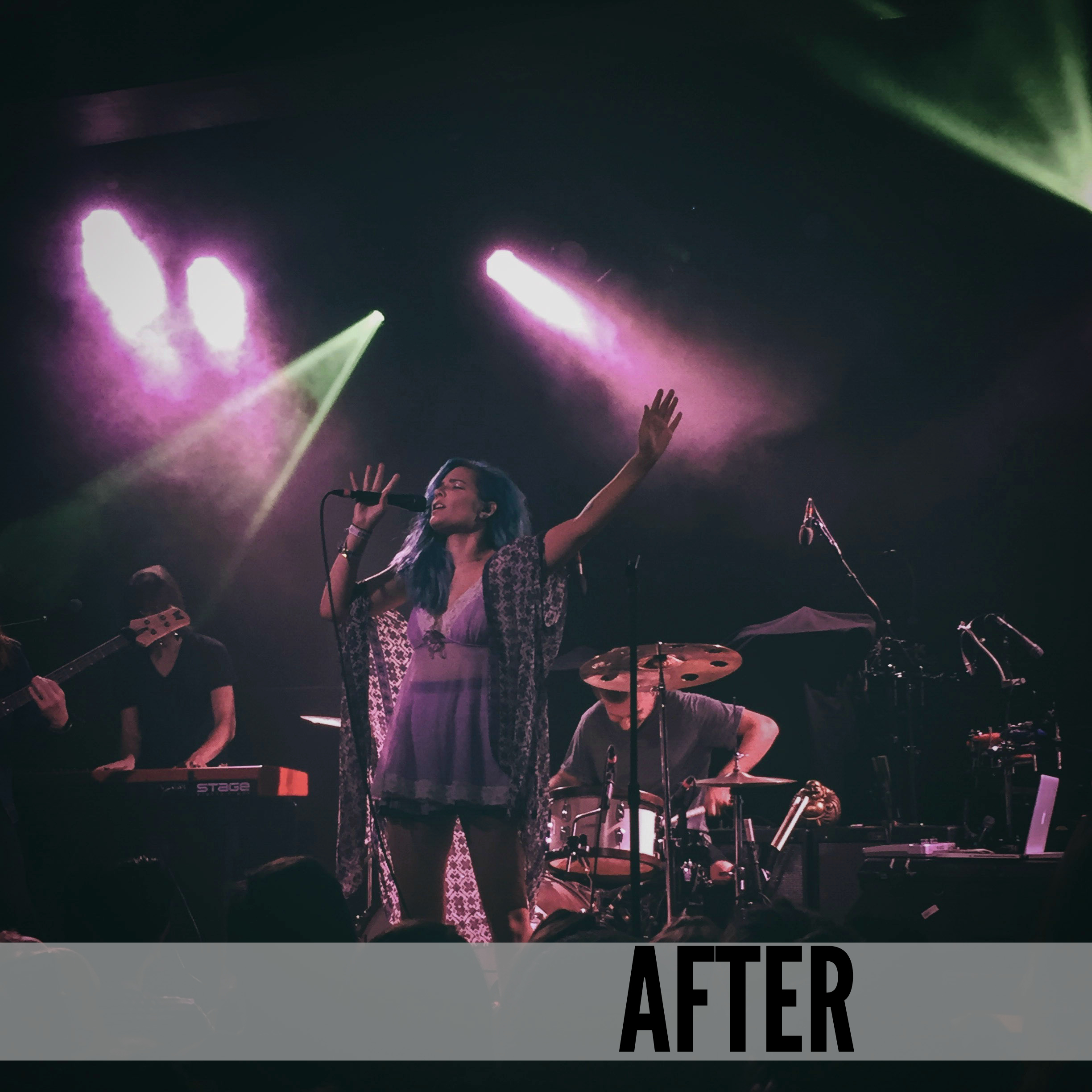
Photo #2 was taken last Fall at a Kooks concert. Halsey was the opener and I really dig her music and style so I snapped a photo. As you may expect, the concert light wreaked havoc on this picture. These are slightly different shots, I didn't have the original in my phone anymore but these were taken within milliseconds from one another, same lighting I assure you. A little tip for shooting at a concert, don't bother lifting your camera if the lighting is an overppowering purple or blue tone; you'll almost never get a good shot. Red's are okay, you can usually get a decent black and white out of it, but there's something about those cooler tones that just destroy what could otherwise be a great image. Oranges and Whites are always best when it comes to concert shots. Anyway, to fix this shot I loaded it into VSCO. I darkened it as much as possible and bumped the contrast until it was usable. I also toned the saturation waaaay down. It's not a perfect shot but it's doable for Instagram. Definitely one of the better shots I got at that show--Given the lighting situation.
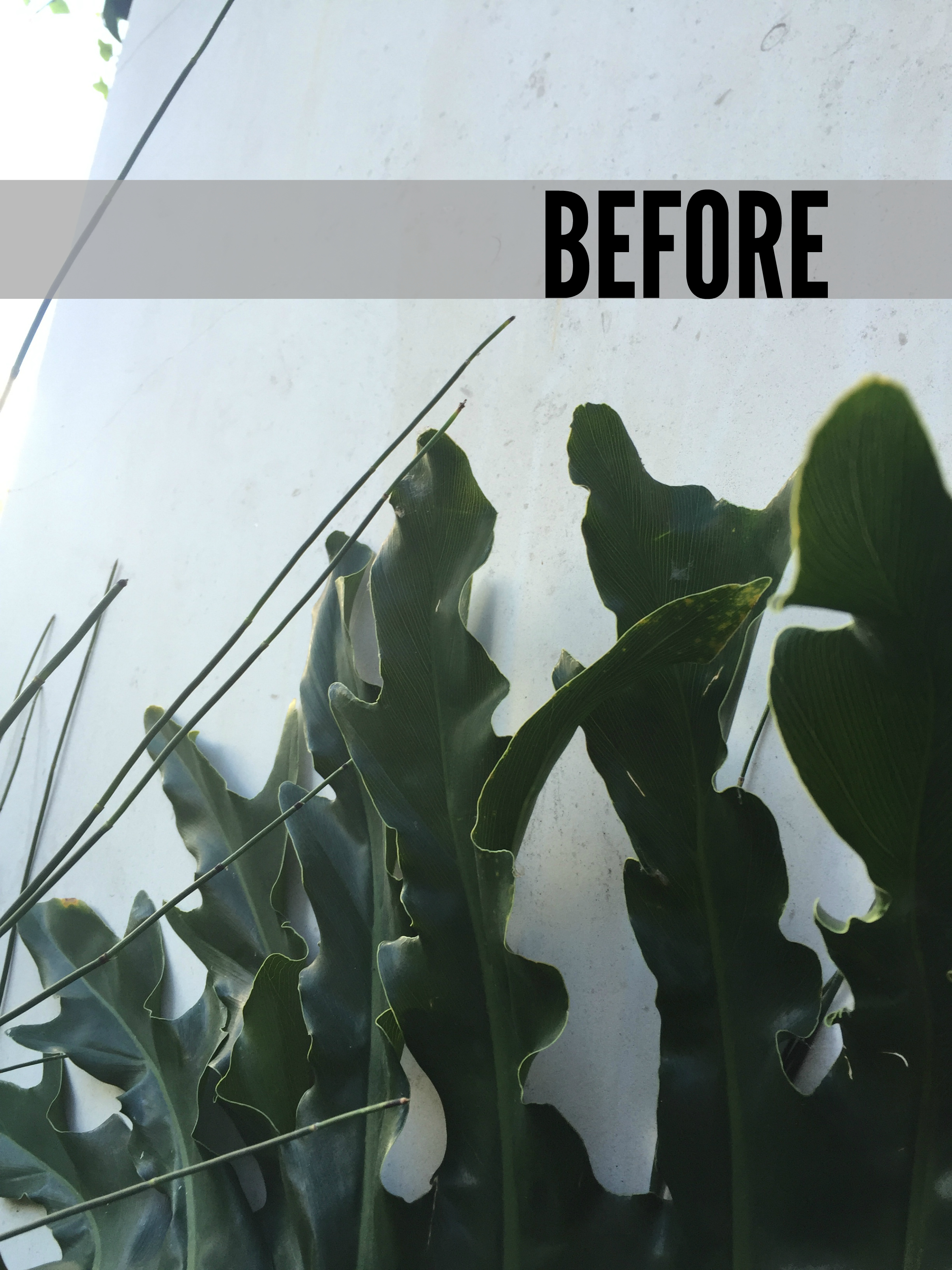
This was a more recent shot taken in SW Portland, near the Keller fountain. I have a deep love for tropical green plants and when I saw these against the white wall I knew I had to take this photo-opp. I thought it was a decent before shot, but I seem to have a running theme on my instagram page where I boost the whites as much as possible. I applied my favorite filter and bumped the contrast 2 notches. Filters with the contrast boosted can sometimes make my images dark, so I also brightened it a bit to bring that stark white look back. There's something a little bit eerie about this shot that I like a lot.
This last photo is probably one of my favorite iPhone shots to date, you may have caught this on my instagram last night. As a few of you know I work at Tea Bar in NE Portland. I take the photos featured on our website and social media pages. I also do a little Branding work with the owner, Erica. We were in between some product shots a couple of weeks ago and I noticed this cool shadow of our logo shining in from the window. The chairs were in the right spot so I took out my phone and snapped a photo. The outcome was alright, it was definitely a sharp photo which is what I like a lot. Despite what I said about contrast in the first photo, you can't mimic sharpness. You can make a photo appear sharp, but only so much before it starts to look like you edited it that way. Getting a sharp photo straight out of the camera is always the best way to go. After taking this photo, as you can probably guess I wasn't happy with the walls so I boosted the white by applying a filter and.... boosted the contrast, as always. One other small detail but I also decided to load the photo into the Snapseed app (If you don't have it, GET IT, it'll change your life) and took out the little white bits and a few dark parts on the floor just to clean the photo up a bit. If you live in the Portland area and haven't checked out Tea Bar yet I highly encourage you to do so. I'm there Monday's and Wednesday's so if you see me say hello!
That's it for this post! I hope it was helpful to you in some way. I thought it would be an interesting post to do to show that not only can post processing change the look and feel of your images, but it also helps to know what tools to use and how you can apply them in the first place! If you found this post informative, leave a like below so I know. I'm thinking of doing a part 2 with photos from my camera, so let me know!
- C


